Responsive Resize
Version: 1.3
Commercial
Tool for testing dimension-responsive websites.


Version: 1.3
Commercial
Tool for testing dimension-responsive websites.
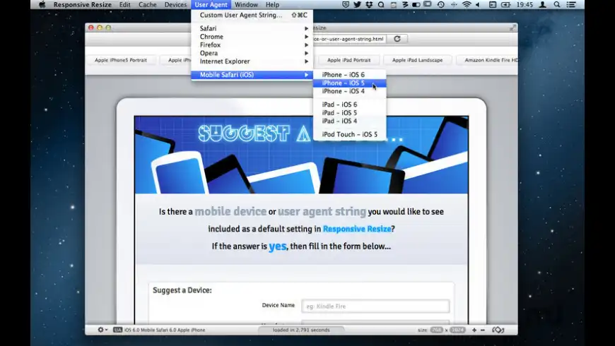
Responsive Resize is a tool for aiding development and testing of responsive websites. Responsive Resize works like a mini-browser with an adjustable viewport which can be altered to match the dimensions of virtually any mobile, tablet or desktop device. Responsive Resize comes with over 40 preset virtual devices, but you can also add as many new devices as you require.
Features:
License
Commercial
Size
2.3 MB
Downloads
Commercial
Developer's website
http://www.responsive-resize.com
App requirements